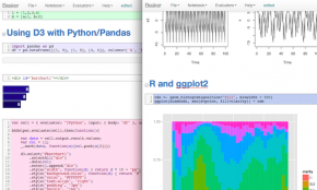
a curated guide to the best tools, resources and technologies for data visualization

Scientific VIsualization

nteract

nteract is a desktop application that allows you to develop rich documents that contain prose, executable code (in almost any language!), and images. Whether you’re a developer, data scientist, researcher, or journalist, nteract helps you write your next code-driven story.

Visokio Omniscope

Visokio Omniscope

Visokio Omniscope is a versatile, multi-tab and multi-view interactive data analysis, filtering and presentation tool. It offers a powerful new way to visualise, explore and report on large tables of data – with related images, maps, links, and more – then lets you share your file with others using the free Viewer. n Examples/references: Demos and screenshots

Visual Sedimentation

Visual Sedimentation

VisualSedimentation.js is a JavaScript library for visualizing streaming data, inspired by the process of physical sedimentation. Visual Sedimentation is built on top of existing toolkits such as D3.js (to manipulate documents based on data), jQuery (to facilitate HTML and Javascript development) and Box2DWeb (for physical world simulation). n Examples/references: Examples

Stata

Stata

Stata is a complete, integrated statistical package that provides everything you need for data analysis, data management, and graphics – you get everything you need in one package.

Sliver

Sliver

Sliver is a powerful and intuitive software application for multi-dimensional (multivariate) data visualization and analysis on Windows.

Quotidian

Quotidian

Quotidian is a new way to visualize time and events. Traditional timelines are limited to displaying events marked along a line. Quotidian displays events in a three dimensional space that can be scaled in all directions to show vast amounts of information.

The R Project

The R Project

R is a highly extensible, open source language and environment for data handling, statistical computing and graphical techniques.

Rcharts

Rcharts

rCharts is an R package to create, customize and publish interactive javascript visualizations from R using a familiar lattice style plotting interface. rCharts supports multiple javascript charting libraries, each with its own strengths. Each of these libraries has multiple customization options, most of which are supported within rCharts. rCharts also allows you to share your visualization in multiple ways. You can save it as a standalone page, embed it in a shiny application, or even include it as a part of a blog post or tutorial.

Re:dash

Re:dash

Rethinking how data is queried, shared and visualized, re:dash is a web application that allows to easily query an existing database, share the dataset and visualize it in different ways. Oh and you can also create dashboards. re:dash is a work in progress and has its rough edges and way to go to fulfill its full potential. The Query Editor part is quite solid, but the visualizations need more work to enrich them and to make them more user friendly. n Examples/References: More info

Rstudio

Rstudio

RStudio is an integrated development environment (IDE) for R. It includes a console, syntax-highlighting editor that supports direct code execution, as well as tools for plotting, history, debugging and workspace management. Click here to see more RStudio features. RStudio is available in open source and commercial editions and runs on the desktop (Windows, Mac, and Linux) or in a browser connected to RStudio Server or RStudio Server Pro.

Seaborn

Seaborn

Seaborn is a Python visualization library based on matplotlib. It provides a high-level interface for drawing attractive statistical graphics.

Pathline

Pathline

Pathline is a very specific visualization tool for comparative functional genomics that supports analysis of three types of biological data at once: functional data such as gene activity measurements; pathway data that presents a series of reactions within a cellular process; and phylogenetic data describing ancestral relationships between species. n Examples/reference: Gallery of images

Python

Python

Python is a powerful, versatile and increasingly common programming language usually deployed as an automation tool on the data handling side of visualisation projects (eg. scraping data, parsing it, formatting it). n See also: PyTables

Jflowmap

Jflowmap

JFlowMap is a research prototype developed at the University of Fribourg in which we experiment with various visualization techniques for spatial interactions, i.e. interactions between pairs of geographic locations.

Jmp

Jmp

This visual discovery software from SAS sets itself apart by linking robust statistics with graphics on the desktop, producing visual representations of data that reveal context and insight impossible to see in a table of numbers.

Matlab

Matlab

All the graphics features that are required to visualise engineering and scientific data are available in MATLAB®, including 2-D and 3-D plotting functions, 3-D volume visualization functions, tools for interactively creating plots.

Matplotlib

Matplotlib

matplotlib is a python 2D plotting library which produces publication quality figures in a variety of hardcopy formats and interactive environments across platforms.

Htmlwidgets For R

Htmlwidgets For R

HTML widgets work just like R plots except they produce interactive web visualizations.

Beaker

Beaker

Beaker is a code notebook that allows you to analyze, visualize, and document data using multiple programming languages including Python, R, Groovy, Julia, and Node. Beaker’s plugin-based polyglot architecture enables you to seamlessly switch between languages and add support for new languages.

BigML

Our goal is to make machine learning simple and beautiful. Our service can take the complexities out of creating a high-availability, low-latency Machine Learning system created especially for your data. You will not only gain valuable insights from your data, you will most likely enjoy it. From the developer, to the researcher, to the multinational corporation, BigML has something that can uncover the hidden predictive power of your data. BigML wants to make you the master of your data.