Keshif.me
Keshif turns data into a beautiful live dashboard in seconds.

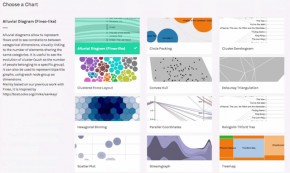
a curated guide to the best tools, resources and technologies for data visualization
Keshif turns data into a beautiful live dashboard in seconds.

ID3 is an Integrated Development Environment for Data-Driven-Documents (D3). ID3 provides developers, data scientists, journalists and more, with the ability to harness the power of D3.js, and with ease.
Lightning provides API-based access to reproducible web visualizations. Turn your data into interactive visualizations, using your favorite language, with or without a server.
Use JavaScript visualization libraries at the R console, just like plots. Embed widgets in R Markdown documents and Shiny web applications

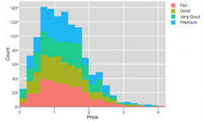
Create and share charts for CSV, Excel and JSON files. Connect and visualize data from apps you are using. It takes no effort. One single place, the natural way, all for free.
A simple-to-use web app that allows you to upload your dataset and instantly generate an interactive visualization. Free, fast, gorgeous visualizations (not responsive).
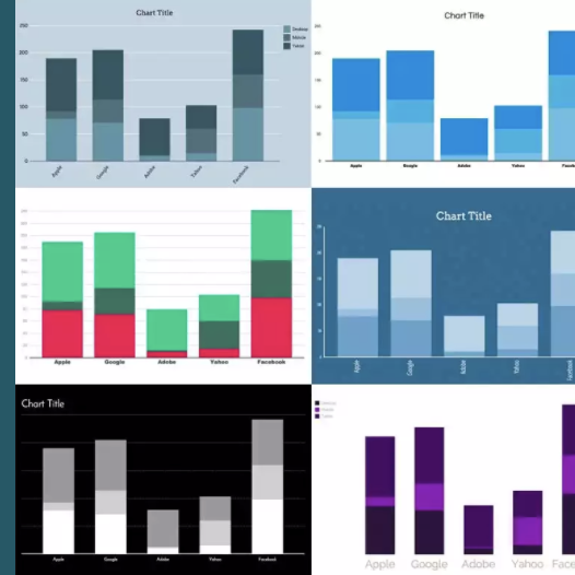
DataVisual makes it easy to create stunning data visualizations. Our intuitive web-based interface offers pre-designed templates that anyone can use while giving design teams the power to rev up workflow and quickly output large volumes of custom data graphics.
Build interactive HTML5 charts using ZingChart JavaScript charting library and feature-rich API set. Render them in any browser and on any device. Export them quickly and easily.

An interactive Python data visualization plugin that runs straight out of an iPython Notebook and can be easily shared.

A freemium web tool that allows for basic creation of line, bar, scatter plot graphs.
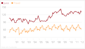
DataWrapper is, by leaps and bounds, the fastest, most beautiful, responsive way to create interactive charts in seconds. You can host it on your own server also, if you want to customize it.
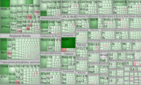
TreeMap provides an easy, yet extremely powerful means of creating beautiful treemaps for analytical and presentation purpose. Importing data from a wide variety of file formats (including of course Excel), as well as connecting to databases (such as MySQL and SQL Server) is a breeze… and it scales to big data.
Vega is a visualization grammar, a declarative format for creating, saving and sharing visualization designs. With Vega you can describe data visualizations in a JSON format, and generate interactive views using either HTML5 Canvas or SVG. n Examples/references: Tutorial
Create and share charts for CSV, Excel and JSON files. Connect and visualize data from apps you are using. It takes no effort. One single place, the natural way, all for free.
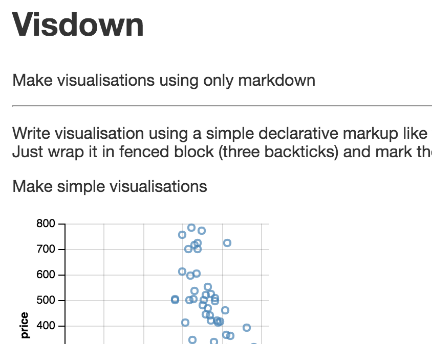
Make visualisations using only markdown
Powerful open-source visualization tool with GUI and dashboard analyses (submitted by Jean-Michel Daignan).
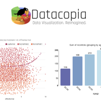
Datacopia uses advanced data science to examine and evaluate your data. It then picks, ranks, and generates the most appropriate visualizations for you. And fast! You no longer need to decide (or know) up front how best to represent your data.
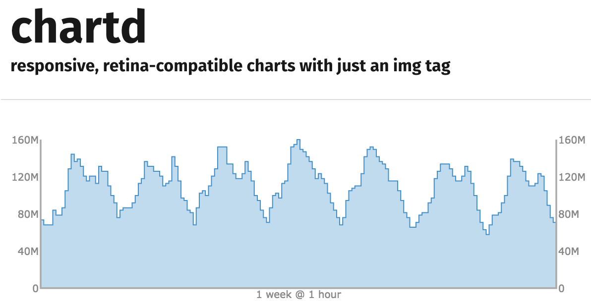
Responsive, retina-compatible charts with just an img tag
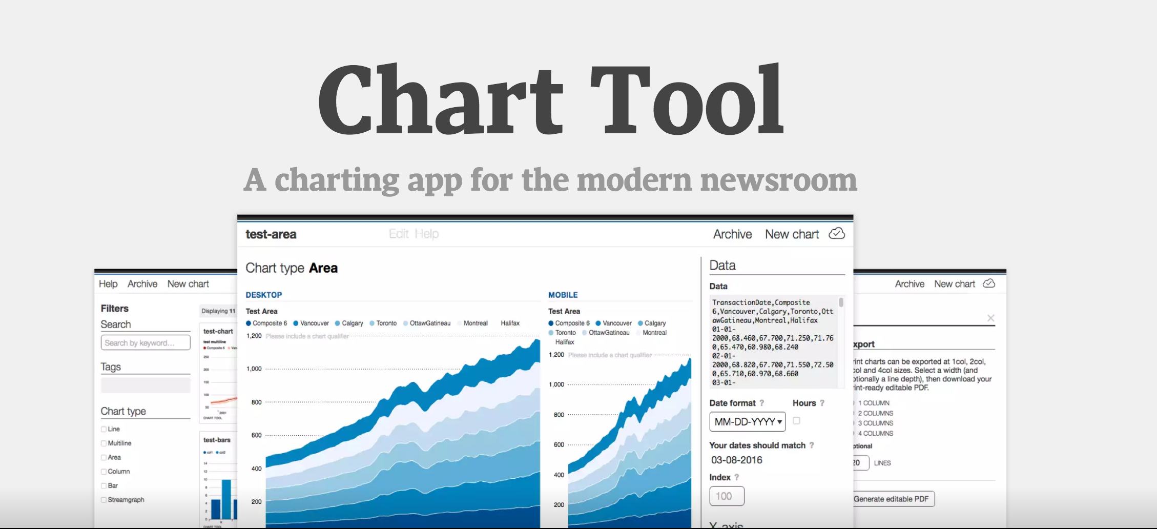
Chart Tool is a platform for creating beautiful charts in under a minute. Designed to fit the needs of a fast-paced mobile and print newsroom, Chart Tool generates responsive interactive charts for the web, JPGs and PNGs for social media and PDFs for print.
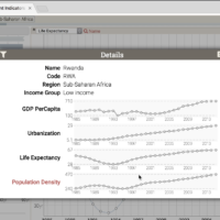
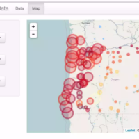
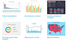
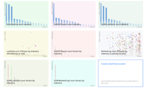
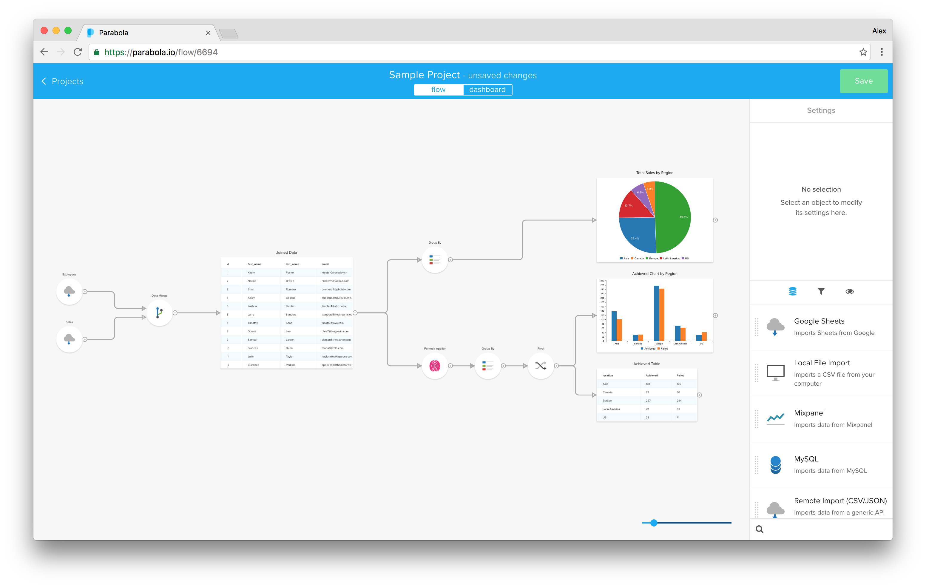
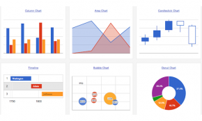
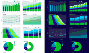
A powerful web app that allows you to import multivariate datasets and create a full dashboard of interactive filters — and it’s mobile-friendly.
Highcharts makes it easy for developers to set up interactive charts in their web pages
Easily import, manipulate, and visualize your data without spreadsheets or code.
Tableau Public is perhaps the most popular, free-to-use web-based, publicly accessible visualization software for creating complex dashboards. It is the free version of Tableau Desktop, which enables you to create interactive visualizations and embed them into your website, publish them on the Tableau Public Gallery or share within the Tableau Public community. Note, the visualizations cannot be saved locally, that is the ‘public’ essence of this free tool, but you can now link up to 1.5 million records. Especially recommended for minimal learning curve.
Bring your data to life: Chart Component Suite with Maps and Gauges for Developers. Quick and easy chart design. Hugely dynamic and interactive charts. Deliver charts across multiple platforms and devices
With Quadrigram you can create custom data visualizations in an intuitive way with the flexibility of a visual programming language. It enables you to prototype and share your ideas rapidly, as well as produce compelling solutions with your data in the forms of interactive visualizations, animations or dashboards.
Raw is an open web app to create custom vector-based visualizations on top of the amazing D3.js library through a simple interface. Primarily conceived as a tool for designers and vis geeks, Raw allows to export visualizations in vector (SVG) or raster (PNG) format and embed them in your web page. Open-source web app, but secure nonetheless as no data is saved.
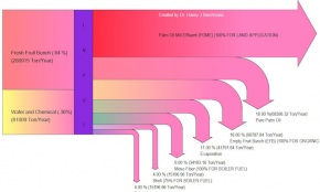
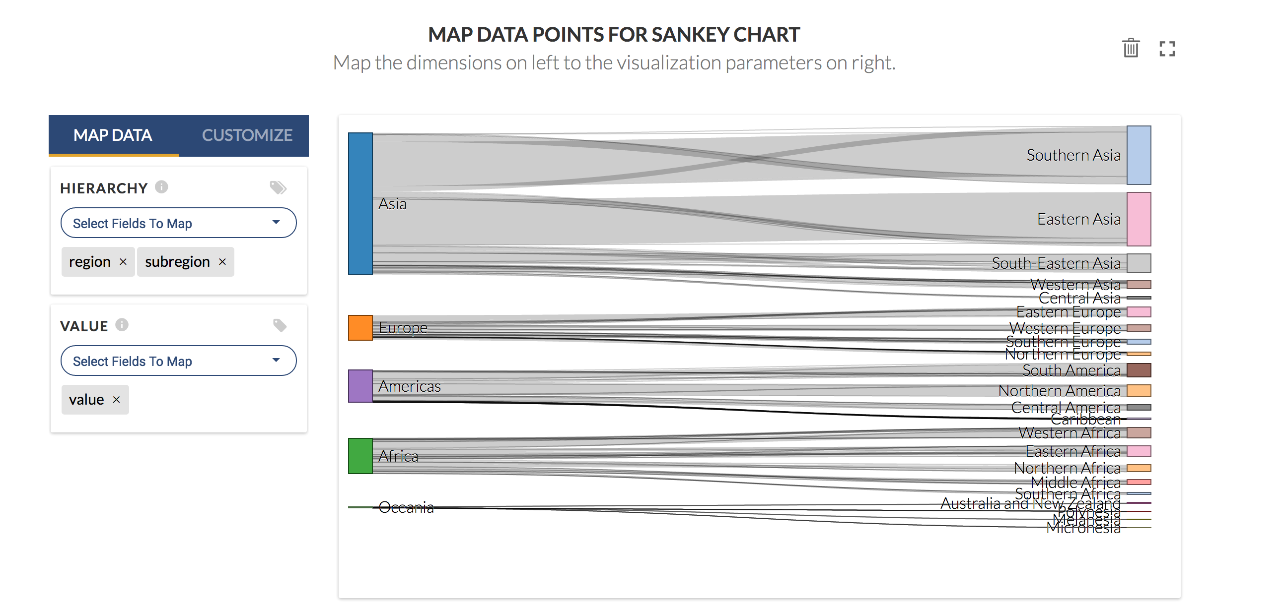
Sankey Diagram Maker is a new software tool to easily create Sankey diagrams, allow you to adapt Sankey flow charts to your individual needs. It is the only tool that offers a FREE Sankey Diagram Maker.
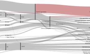
Sankey diagrams can be difficult to produce without specialized software. SankeyMATIC aims to change that. There are no tools to install. There is no code to write. You do not have to sign up for anything. Just enter your data, customize the diagram to your liking, and download a finished product. SankeyMATIC builds on the open source tool D3.js and its Sankey library, which are very powerful but require a fair amount of work & expertise to use. SankeyMATIC unlocks the capabilities of the D3 Sankey tool for anyone to use. n Examples/References: Gallery
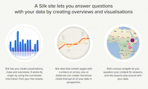
A Silk site lets you answer questions with your data by creating overviews and visualisations. It lets you create visualizations, maps and overviews. It works its magic by using the connected information from your fact sheets. Silk sites that contain pages with numbers on prices, size or distances can create interactive charts that put all of your data in perspective.
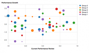
Plotly offers a very engaging and user-friendly option for creating a range of visualisations within the browser. Simply upload your data (from a number of sources), choose your graph type, style it with publication-quality layout and colour options, dive into the data to refine then publish and share.
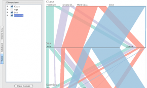
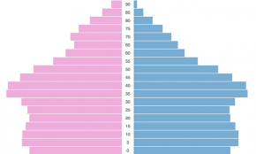
Parallel Sets (ParSets) is a visualization application for categorical data, like census and survey data, inventory, and many other kinds of data that can be summed up in a cross-tabulation. ParSets provide a simple, interactive way to explore and analyze such data. Available for Mac, Windows and Linux. n Examples/reference: Article
Turn your analyses into interactive web applications. No HTML, CSS, or JavaScript knowledge required
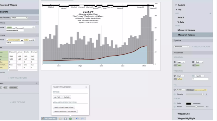
Lyra is an interactive environment that enables custom visualization design without writing any code.
Google Charts provides a perfect way to visualize data on your website. From simple line charts to complex hierarchical tree maps, the chart gallery provides a large number of ready-to-use chart types. The most common way to use Google Charts is with simple JavaScript that you embed in your web page. You load some Google Chart libraries, list the data to be charted, select options to customize your chart, and finally create a chart object with an id that you choose. Then, later in the web page, you create a div with that id to display the Google Chart. That’s all you need to get started.
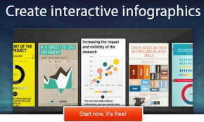
Infogram lets you illustrate your data, offering more than 30 chart types from bubble charts and treemaps to simple pie charts to create infographic images.
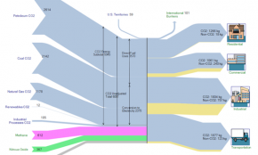
e-Sankey is a powerful tool for drawing special process maps (known as Sankey diagrams): Visualize your cost, material and energy flows in your company.
We grow graphs. BlockSpring lets you build visualizations from the most innovative blocks developed by engineers within your organization, and from around the world. Need something awesome? Your engineering team or ours can build proprietary graphs just for you.
A front-end charting application that facilitates easy creation of simple beautiful charts
Charted is a tool for automatically visualizing data, created by the Product Science team at Medium. Give it the link to a data file and Charted returns a beautiful, shareable chart of the data.
Create your charts the easy way. Chartlr makes it really easy to import your spreadsheet data, choose a chart or graph type, apply your favorite design settings to your chart and export it as a PNG, SVG or PDF.
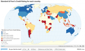
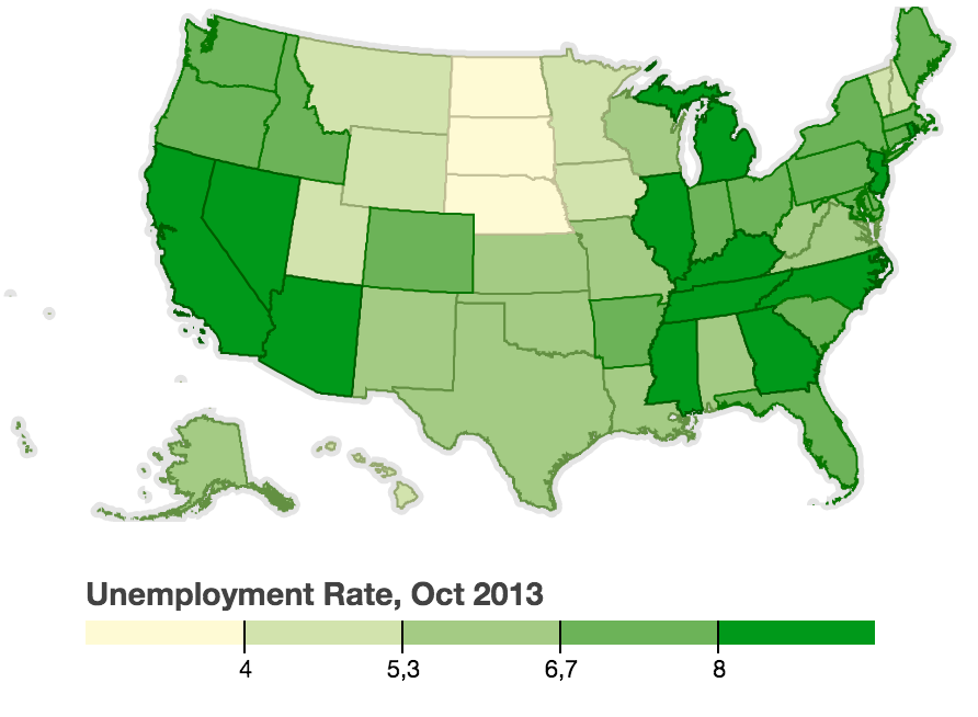
ChartsBin is a web-based data visualization tool that will allow everyone to quickly and easily create rich interactive visualizations with their own data. You can then share your interactive visualizations with others by embedding them in websites, blogs or sharing via Facebook or Twitter. We’re focused on building the most exciting and engaging destination for statisticians, and computer scientists in the world. n Examples/references: Gallery
D3 in a Box: Package a D3 visualization for easy data editing and deployment. Store your data in a Google Spreadsheet. We serve it up fast! Archive and reuse, We keep your visualization in a container you can share. Deploy anywhere - We host your widget as an HTML5 Web Component.
A new piece of browser-based software that runs on top of Google Sheets and allows for the easy, fast, code-free creation of a variety of both basic and complex interactive charts. Highly recommended for multivariate datasets on a deadline.
Simple responsive, visually-minimalist charts with a range of plugins to add interactivity, connect to APIs and more.
A simple-to-use web app that allows you to upload your .CSV files of complex, multivariate datasets and display them in a responsive dashboard of various visualization elements. Great for exploratory data analysis.
Tags: code-free, dashboard, multivariate analysis, responsive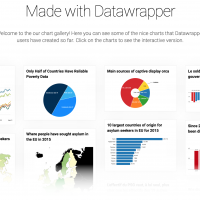
A code-free, easy-to-learn copy and paste tool that creates a range of elegant, fully responsive interactive charts in seconds.
Tags: code-free, responsive charts, responsive data viz