Keshif.me
Keshif turns data into a beautiful live dashboard in seconds.

a curated guide to the best tools, resources and technologies for data visualization
Keshif turns data into a beautiful live dashboard in seconds.

Reflect is an easy-to-use, self-service dashboard visualization tool that connects to your existing data source and creates dynamic, highly filterable dashboards of basic bar and line charts, as well as KPIs. It is not responsive. It offers a freemium level.
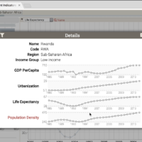
Zoomdata allows you to connect to internal and external data sources, combine, merge, and crunch data streams, visualize the results in real-time, and provide instant access to your colleagues.
Crossfilter is a JavaScript library for exploring large multivariate datasets in the browser.
Vida.io offers an easy way to build reusable cloud visualizations: Clone visualization templates, customize without coding skills and embed/share in the cloud.
Powerful open-source visualization tool with GUI and dashboard analyses (submitted by Jean-Michel Daignan).
dc.js is a javascript charting library with native crossfilter support and allowing highly efficient exploration on large multi-dimensional dataset
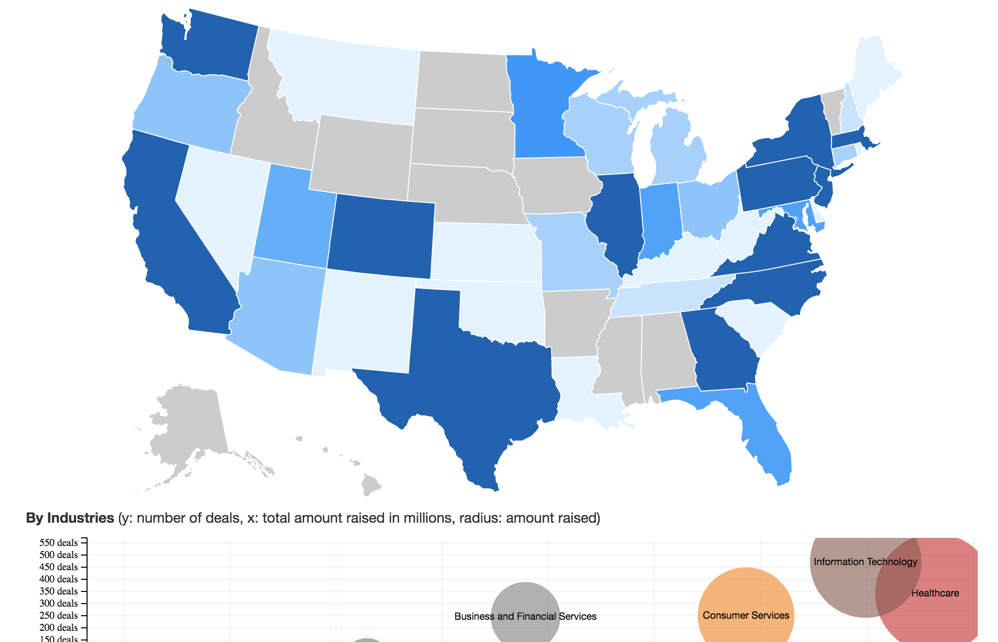
A powerful web app that allows you to import multivariate datasets and create a full dashboard of interactive filters — and it’s mobile-friendly.
Easily import, manipulate, and visualize your data without spreadsheets or code.
Tableau Public is perhaps the most popular, free-to-use web-based, publicly accessible visualization software for creating complex dashboards. It is the free version of Tableau Desktop, which enables you to create interactive visualizations and embed them into your website, publish them on the Tableau Public Gallery or share within the Tableau Public community. Note, the visualizations cannot be saved locally, that is the ‘public’ essence of this free tool, but you can now link up to 1.5 million records. Especially recommended for minimal learning curve.
With Quadrigram you can create custom data visualizations in an intuitive way with the flexibility of a visual programming language. It enables you to prototype and share your ideas rapidly, as well as produce compelling solutions with your data in the forms of interactive visualizations, animations or dashboards.
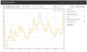
A simple but powerful library for building data applications in pure Javascript and HTML. Recline re-uses best-of-breed presentation libraries like SlickGrid, Leaflet, Flot and D3 to create data ‘Views’ and allows you to connect them with your data in seconds.
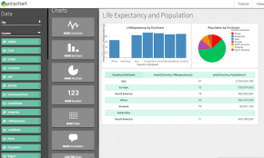
Polychart offers users the chance to easily and quickly build dashboards and charts, connecting directly to your data wherever it’s stored.
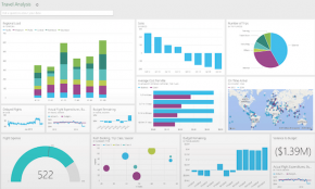
Dashboarding made simple: From zero to insight. Create personalized dashboards and reports on your data in less than 5 minutes, find answers to your most important questions using natural language and drag and drop gestures, and make decisions based on the right data anytime, anywhere, on any device. Your Power BI dashboard is your single view to monitor your company’s health.
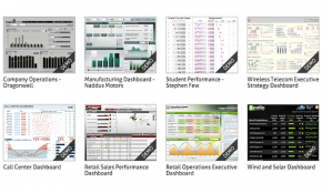
Dundas Dashboard brings together all of the tools you need to build meaningful, interactive and fully customized dashboards in one easy to use platform. n Examples/references: Dashboard Gallery
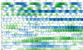
Cubism.js is a D3 plugin for visualizing time series. Use Cubism to construct better realtime dashboards, pulling data from Graphite, Cube and other sources. Cubism is available under the Apache License on GitHub. Examples/references: Demos
An application to create beautiful, branded reports.
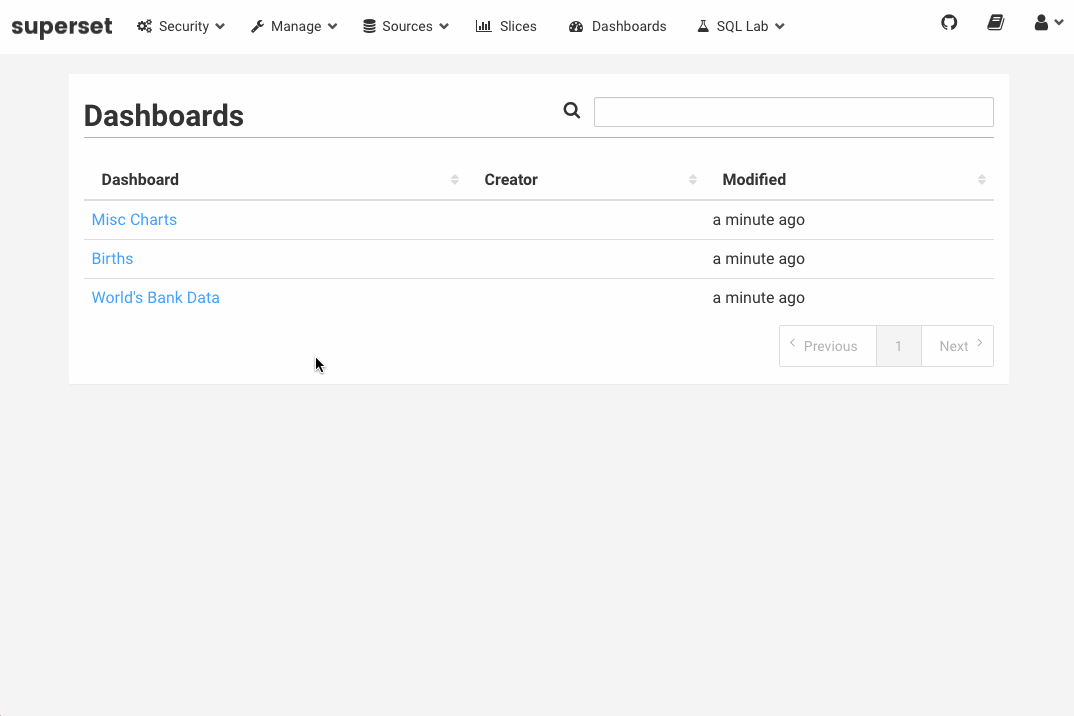
A simple-to-use web app that allows you to upload your .CSV files of complex, multivariate datasets and display them in a responsive dashboard of various visualization elements. Great for exploratory data analysis.
Tags: code-free, dashboard, multivariate analysis, responsive